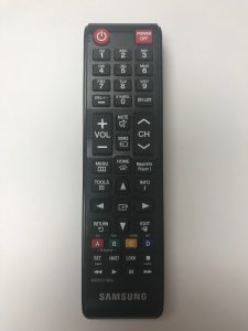
I know, picking on remote controls is low hanging fruit but seriously, a 0/1 power button and a Power Off button?
Bonus question, what is the functional difference between what appears to be a select button in the middle of the arrow keys and the RETURN button? 
Adventures in UI/UX, part one of an infinite series of baffling decisions
A